Daily Journal redesign an investment in what matters – Kankakee, Illinois
Dynamic newsstand presence, contemporary look and deep training program stand out in Creative Circle project for Small Newspaper Group
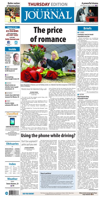
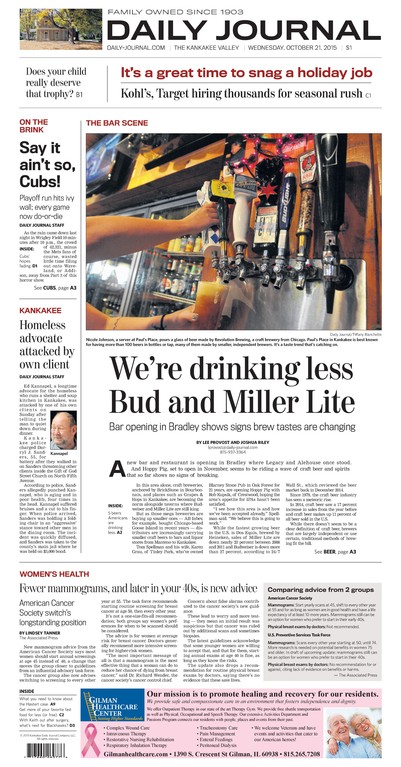

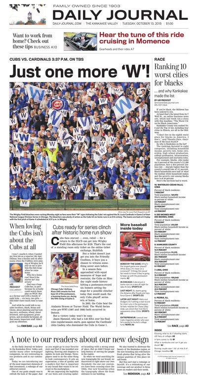
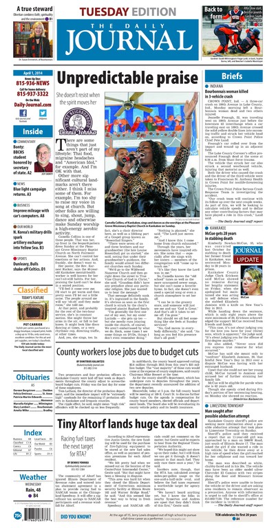
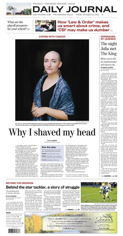
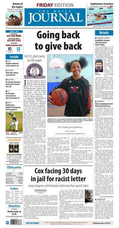
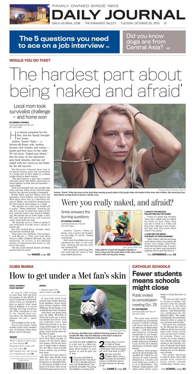
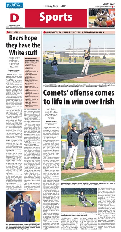

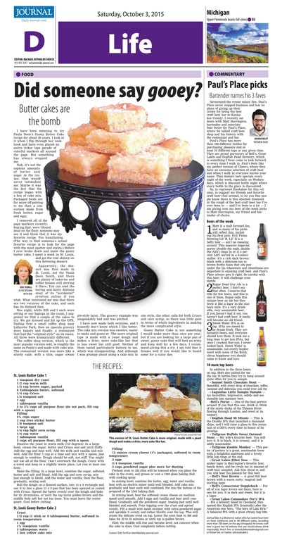
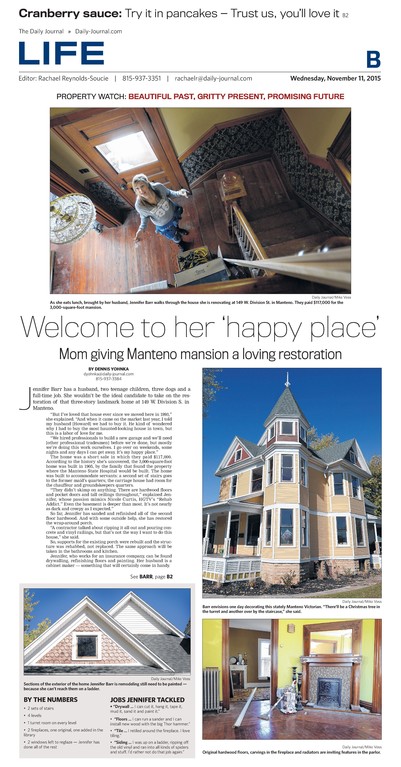
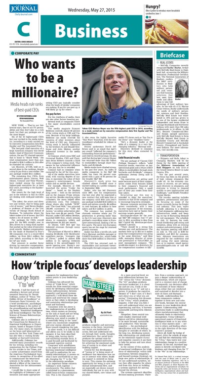
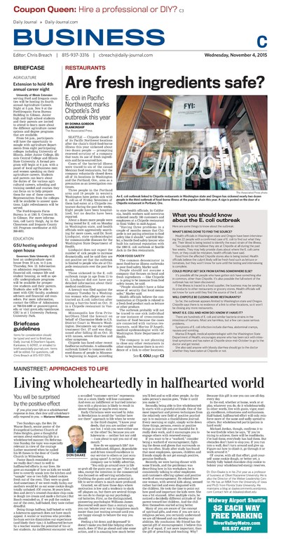

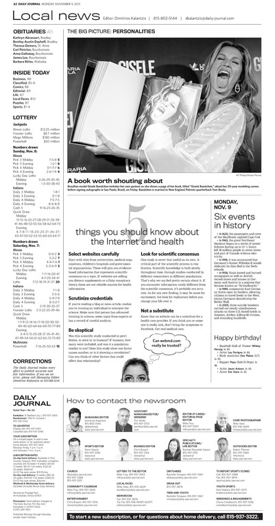


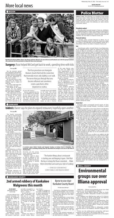
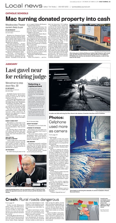
Readers in Kankakee, Illinois, got a message loud and clear this week as the Daily Journal launched a redesigned newspaper that CEO and president Len Robert Small describes as an investment in both the newspaper and the community.
“The Daily Journal matters,” Small said in a statement to readers. “No other media outlet – in fact no other company in this region – touches more people every day than the Daily Journal.”
The new design project, rolled out with improved newsstand presence, contemporary typography, better use of photography and more reader oriented content.
“We love working with publishers who are bold enough to go against the trends in our industry and invest in their print products, their people and their communities,” said Creative Circle founder and president Bill Ostendorf.
Ostendorf went on to emphasize how crucial the decision to invest in the product is to the bottom line. “That’s exactly what newspapers should be doing today, and it’s exactly what they’re not doing. Any expert on business will tell you that you can’t cut your way to prosperity. You have to invest and innovate.”
One feature of the redesign was to pay much closer attention to what is displayed above the fold, and how it worked. “We’re trying to get three or four complete thoughts that are very focused above the fold,” Ostendorf said. “And those items are targeting the demographics of the occasional and non-readers.”
To help make sure those messages look dynamic and interesting, the design provides a lot of flexibility to showcase content, so the paper looks different every day, he added.
“We also wanted a strong sense of place so the nameplate typically features a local photo of some interesting or recognizable local scene. We’re rotating those images to include the entire circulation area,” said Ostendorf. “Readers will pick up the paper and say ‘I know where that is!’”
So the nameplate and top boxes are very fluid in shape and position. “From today to tomorrow, the paper looks very different,” he said. “The worst thing you can do to a newspaper is make it the same every day.”
That improvement was implemented early in the redesign process, long before the launch this week.
Hubs that work: Streamlined with dynamic design
Overly formatted front pages are the unfortunate result of many newspapers intent on cost-cutting by using design hubs for production. “I think having all the papers the same is naive,” Ostendorf said. “Everybody who does this and makes those decisions knows nothing about design.”
In the redesign of The Daily Journal, Creative Circle has assisted Small Newspaper Group in achieving the best of both worlds, streamlined costs with flexible, vibrant design that’s responsive to the news and the community it serves.
“We find it’s very easy to make a hub efficient AND make the design better,” Ostendorf said. “We can do cost-cutting AND a quality improvement. That’s the secret sauce in managing a modern media company.”
Reengineered from the inside out
Out of the Small Newspaper Group hub, the staff produces four daily newspapers, a weekly agriculture paper and several magazines.
Extensive training was a big component of the redesign, Small told readers at a launch event and his letter to readers in print. “(The redesign) involved a frank and critical look at our content, workflows and technology.”
This week was just the beginning, Small said. The process with Creative Circle launched more than a year ago, and so did the evolution of the editorial process. The Daily Journal has a new editor and better design resources. More improvements are ahead as the higher standards and goals will be implemented, Small added. “More than anything else, we are hoping this investment will result in a more relevant newspaper doing a better job of earning your trust and your commitment.”
Small sees it as an investment in the community of the Kankakee River Valley. “Unlike many other newspaper companies, we are reinvesting in our products and our community,” he said.
The changes go beyond a refresh, he said. The aim was to look contemporary, to set an expectation that’s important to any brand that wants to be relevant in the marketplace.
Small Newspaper Group, founded in 1903, has a long history of being a big media player, as well as an engaged presence in its Illinois and other Midwestern communities. For many years, Small served as chairman of the board of United Press International after his partnership acquired the wire service. His great-grandfather served two terms as governor of Illinois.
The case for print
Most newspaper readership still comes to print, a point often lost in public dialogue about the shift to digital platforms, which just one more reason Ostendorf advocates investing in the product to increase revenue. Of those who read a newspaper, 56 percent read it exclusively in print, according to readership data from the Nielsen Scarborough’s 2014 Newspaper Penetration Report, and that percentage is up from 2013.
