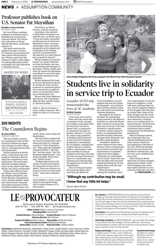
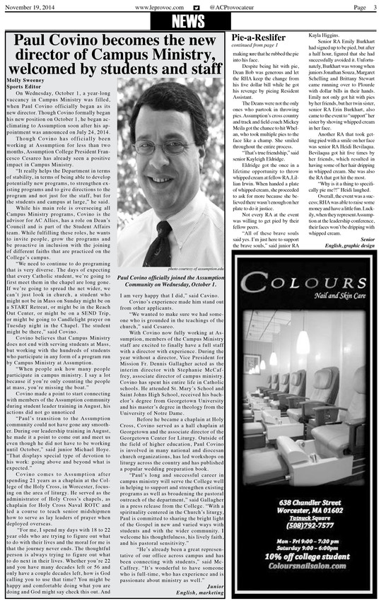
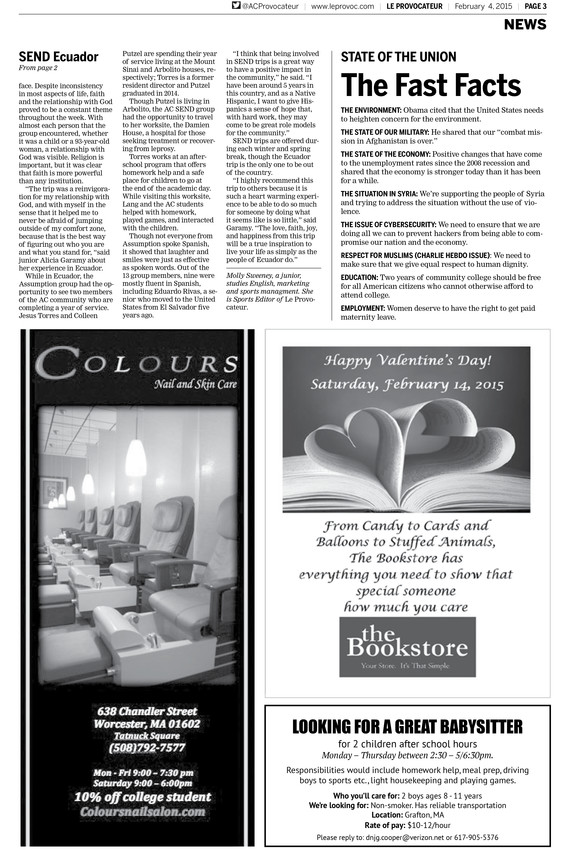
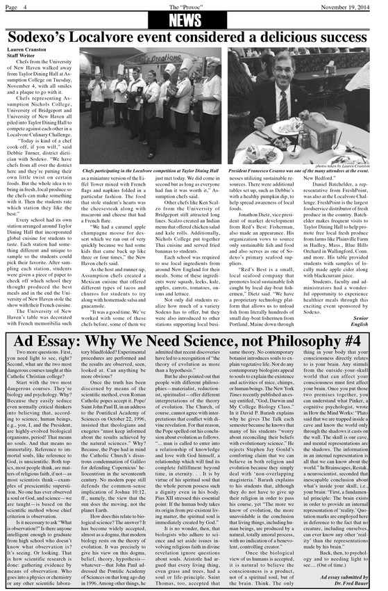
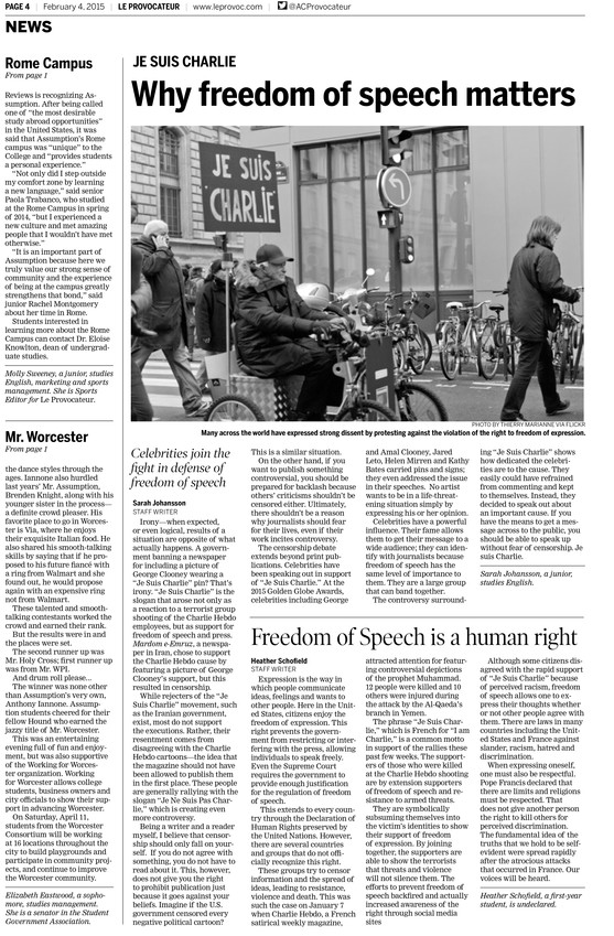
Le Provocateur celebrates anniversary with modern look that honors tradition
Assumption College’s campus newspaper, redesigned by Creative Circle, sets a new standard for future editors and builds in training component that gives staff a boost
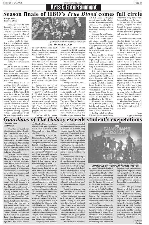
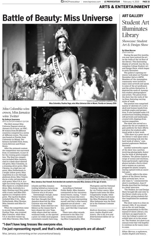
For the 50th anniversary of Le Provocateur, the student-run newspaper of Assumption College, it was time for a sharper, modern presentation that linked back to the paper’s roots.
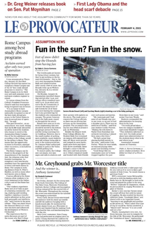
The result? Not only a new look, but an invigorated staff of student journalists and more engaged readers across the campus. “Editors change from year-to-year,” said Mike Guilfoyle, executive director of communications at the college in Worcester, Massachusetts. “However, the new design has set a new standard for future editors to meet and exceed.”
The Creative Circle Media Solutions redesign launched in January 2015 and included a huge training component.
“We honestly couldn’t be happier with the project,” said editor-in-chief Kaitlyn Akers.
It was an interesting challenge to link to tradition but appeal to modern readers, said Creative Circle president and founder Bill Ostendorf. "Like many of our redesigns, which sometime celebrate anniversaries like this, we wanted to retain much of what the paper is or was during the past 50 years, so we tried to be sensitive toward finding ties to their roots."
“Everyone loves the new look!” Akers said, including writers who want to participate. “We’ve had more writers in the most recent three issues than I have seen in the three years I’ve worked for the paper.”
Guilfoyle had used Creative Circle before, for a redesign project when he worked for the Diocese of Providence, Rhode Island. On that project, he had been impressed with Creative Circle’s “attention to detail, sharp eye for effective design and knowledge of print journalism,” he said.
The end result for Le Provocateur was a professional presentation, Guilfoyle said, with much more content of interest to the campus community.
Seeking a new identity
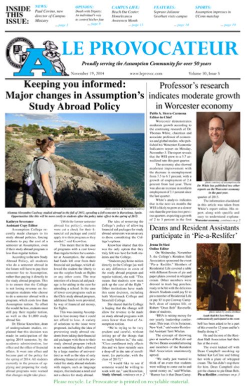
Because the paper had been around for a long time, that presented a design challenge, said Creative Circle’s lead designer Lynn Rognsvoog. “They had several different identities,” she said. “The one we inherited was definitely aging.”
First, the team looked at the nameplate. “The nameplate had lots of goop in it,” she said. “A college seal, a mascot, the title, a lot going on.”
Students took the lead, Ostendorf said. “I was surprised and impressed by how hands-off the college and advisors were in letting the students take the lead in this process. They made the decisions and I hope we created the paper they wanted and imagined having."
Unearthing treasures
Many of the essentials for a vibrant design are the same, no matter the publication, Ostendorf said. “Produce more relevant content, write headlines that engage me, add more decking to inform and hook the scanning reader, use more casual and personal language throughout, use alternative story forms and approaches, play good photos larger and spend less time covering institutions and more time covering what readers actually do and how they live.”
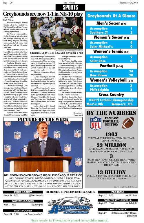
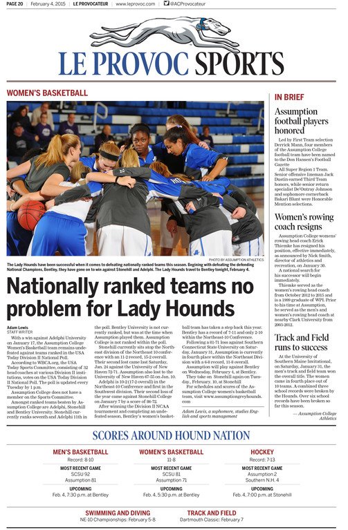
Hound Nation was one of those new features, which was how people referred to the college’s sports team, in conversation and on Twitter. When Rognsvoog was prototyping the new design, someone said something in passing about Hound Nation, which is something people on campus say and talk about, all around the idea of the athletic mascot, the greyhound. “Wait a minute, that’s an idea we can run with,” she said. “That’s something that’s so personal to this particular college. It’s not something we should leave locked up in a gymnasium.”
The staff built a coverage identity around the Hound Nation idea, which involved coordinating better coverage with the athletic department. “Students had no idea they had this resource on campus they could use to make their coverage fuller,” she said. “When we had on things like Hound Nation, it’s real gift.”


.pdf.jpg)
